Deliverables
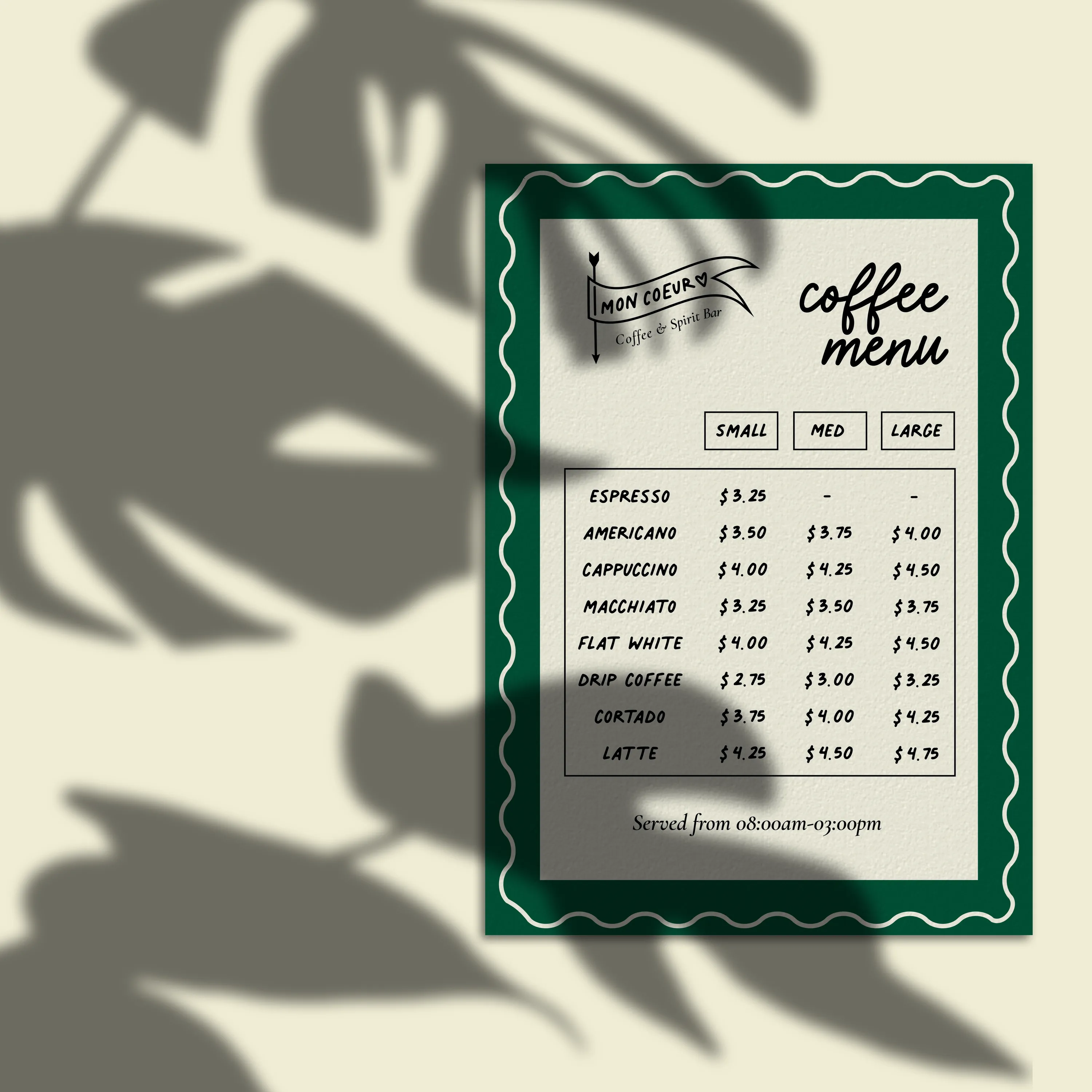
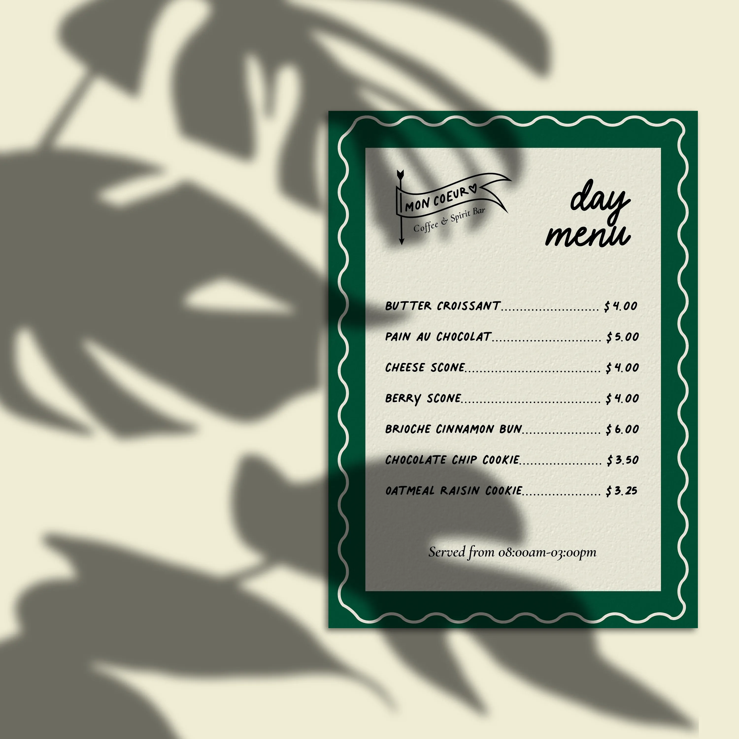
- Coffee + day food menu
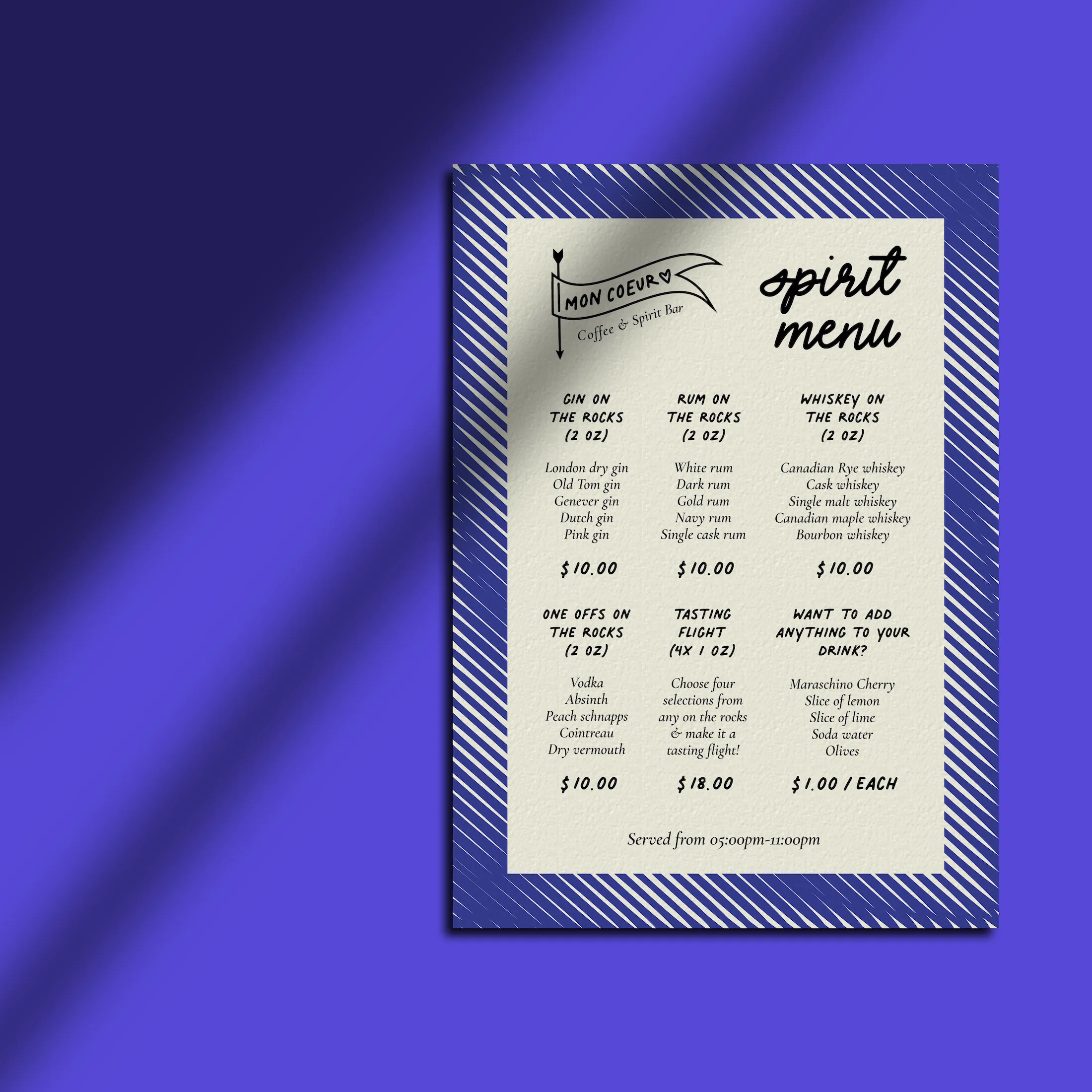
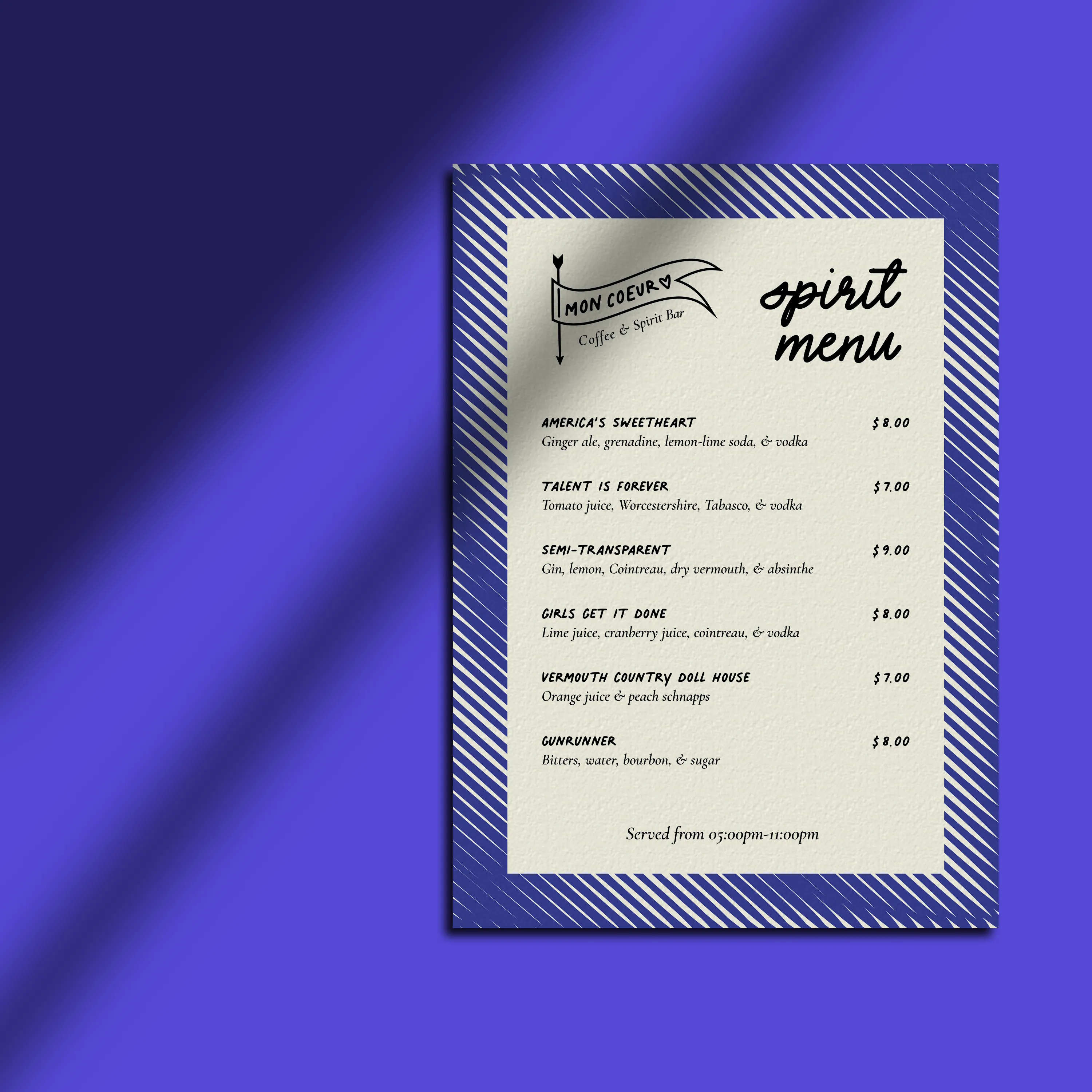
- Spirit menu with specialty drinks
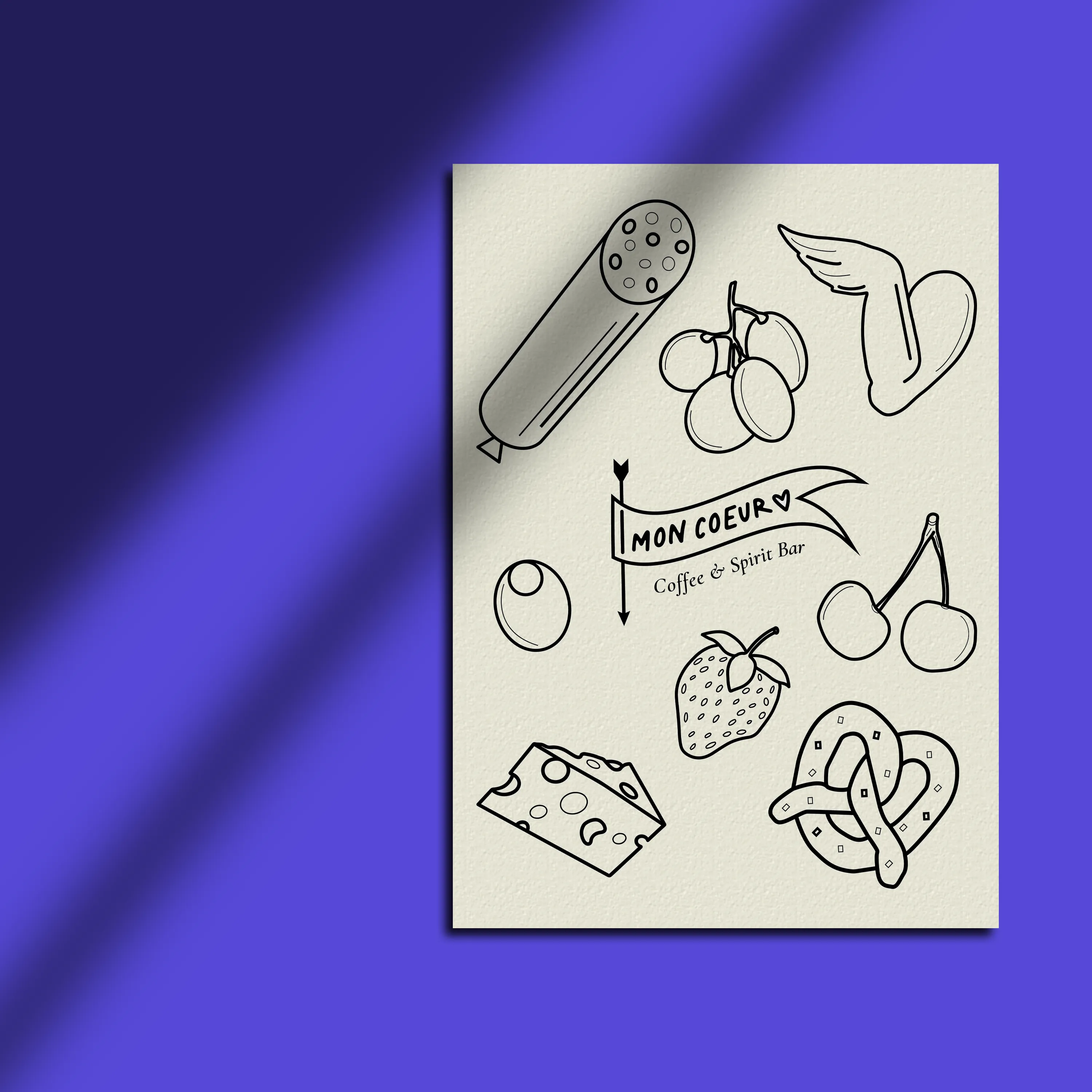
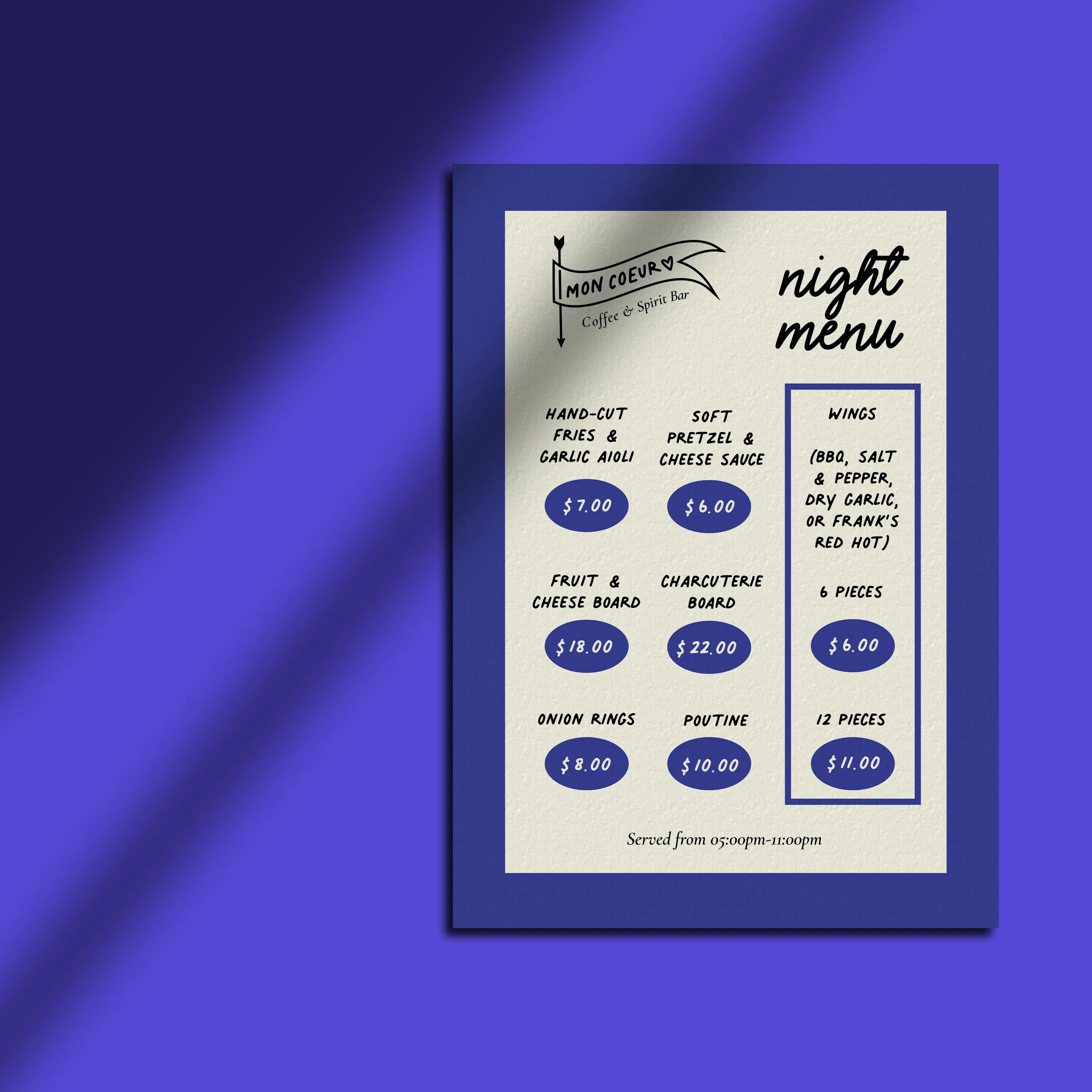
- Night food menu with illustrations
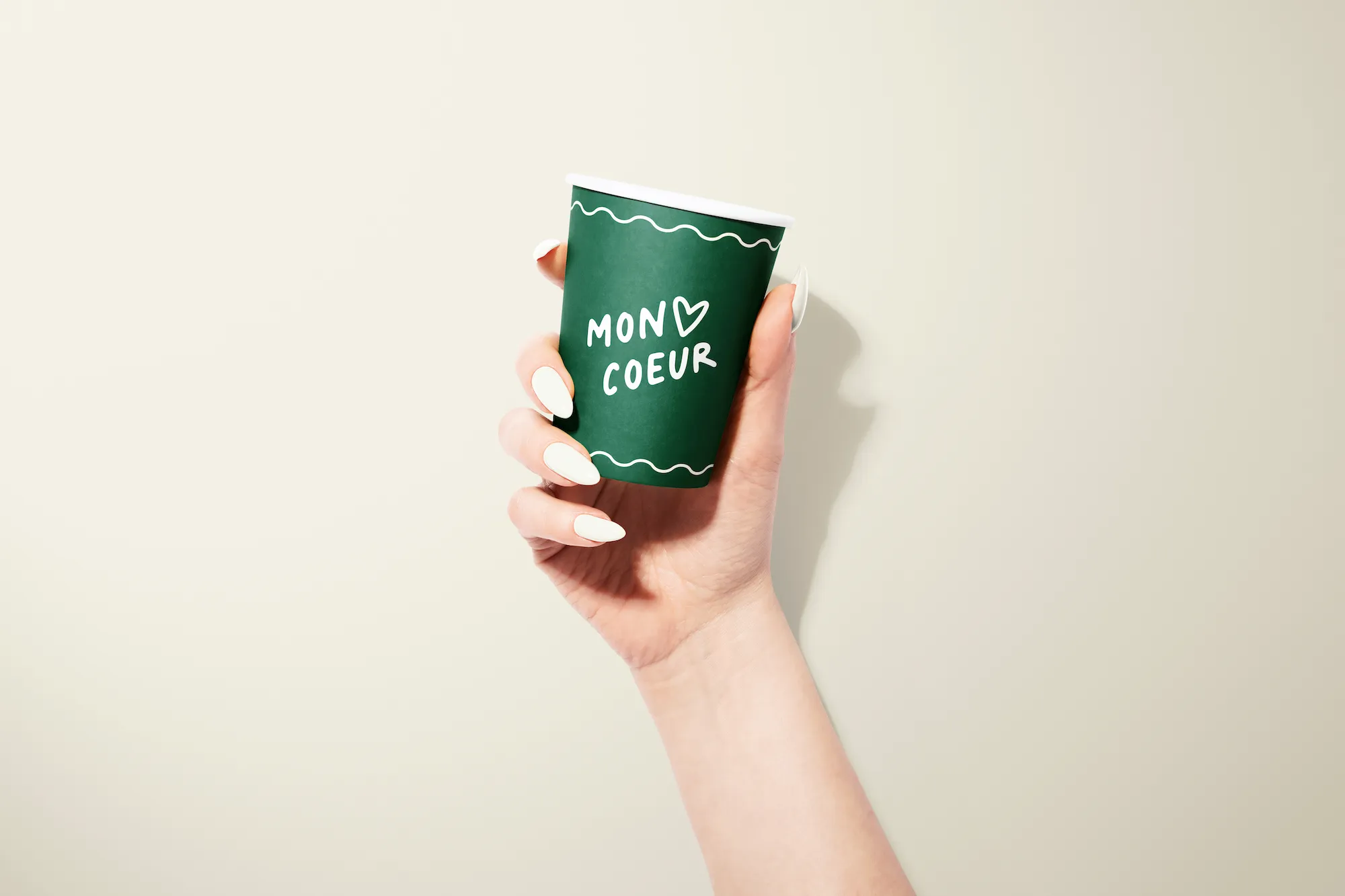
- To-go coffee cup packaging
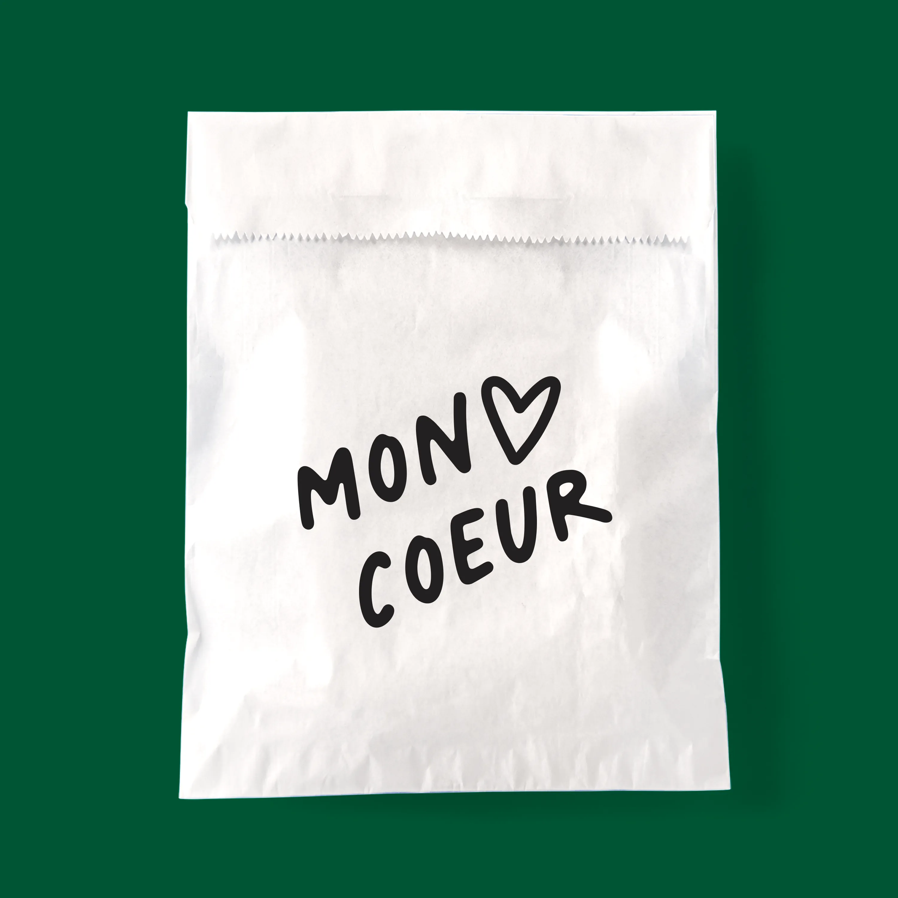
- Pastry bag packaging
- Logo design
Programs
- Adobe Illustrator
- Adobe InDesign
- Adobe Photoshop
Did anyone else binge-watch the boys? This project was sparked by Kimiko and Frenchie’s relationship and their pet name, Mon Coeur. I wanted to create a local haunt that was a coffee bar by day and a spirit bar by night.
The primary logo design for mon coeur is composed of three primary objects: cupid’s arrow, a waving white flag (symbolizing surrendering to love), and a simple coeur (french for heart). The secondary logo is a simplified version with the heart and the stacked company name.
The menu design is cohesive and complimentary for both coffee and spirit bar parts. With equal borders, logo/header placement, and font choice throughout both, yet unique and easy to differentiate through the individual color and pattern choices. In keeping with the same-but different, scheme i wanted to use an analogous color palette; for the coffee bar, i chose a jewel green to invoke a comforting and natural feel; and for the spirit bar, i chose a royal blue for a moody and refreshing feel.
In essence, i wanted to create a romantic and unpretentious establishment that one would want to take a date (that you want to impress) to.
